Evolving Wanderer’s Visual Brand Identity for Digital Impact
When we embarked on a new digital fan experience transformation project with Bolton Wanderers we took a closer look at their visual brand identity. As the club comes back stronger than ever from a tough period, on and off the pitch, they needed to make the most of their digital platforms.
The club is one of the 12 founder members of the Football League and they are a club firmly cemented in the lives of so many in the north-west of England. This project was therefore never about changing the clubs brand identity but updating the visual treatment of their brand assets to align with the club’s upward trajectory, championing their heritage and introducing a suite of ownable elements that brought the brand to life, with a focus on how it is applied in a digital context.
The vital importance of the club story
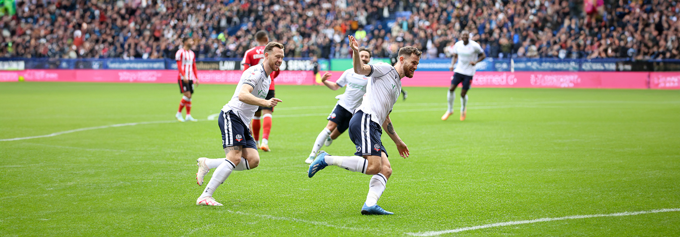
For Bolton Wanderers FC there has been a recent history of instability and uncertainty and this has been felt across the club and community.
A turbulent financial period leading up to new ownership in 2019 was followed by relegation to League 2 after the 2019-20 season (that was prematurely terminated due to COVID). Wanderers have since had a remarkable turnaround to gain promotion to League One at the end of the 2020-21 season and win the EFL Trophy in 2022-23.
The launch of a new website and app were therefore coming at the perfect time to breathe new life back into the club.
Siobhan Chaplow, Chief Communications Officer at Bolton Wanderers explains: “We wanted to refresh the Wanderers brand, bring some synergy across everything, and celebrate the history of the club.
“The club’s identity and how we present ourselves is fundamental and the new look and feel of our digital platforms is part of that – it’s part of the fabric of the next chapter in our story.
“We wanted this new approach to be a vehicle to showcase the best of Bolton Wanderers.”

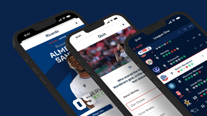
Translating from print to digital
To support a club’s story, through written and visual communications, a tool that we utilise as a core building block to any design project is the club’s brand guidelines. These are mostly written with print media in mind. When it comes to applying these to digital media like websites, apps, and social media, the existing guidelines don’t always work.
This was partly the case with Wanderers and therefore we wanted to be sympathetic to the existing guidelines and enhance the visual identity. The new designs needed to be digitally led, rather than constrained by print guidelines that typically don’t allow for the small sizes and the movement that digital media affords. Wanderers, as we often see, had no pattern or motion treatment guidelines as these had not been needed before. This was a chance to bring BWFC to life.
Avoiding high cost licences
Fonts that were previously in use were going to command exceedingly high digital licence fees, which made them unobtainable for the club’s budget, and so we looked at alternatives that could be adopted across social media, marketing communications through email, retail, and on the website and in the apps, as well as in the printed programmes and across the in-stadia screens and LED system.
For the headline typeface an all-caps angular font, Nippo, was selected to replicate the angular elements that have added to the decorative adornments of the site design – the diamonds, and the angular cut-outs in the ribbon of the crest. The typeface itself has lots of 45 degree cut-outs that mirror the negative space of the diamonds. It was therefore an ideal choice to complement the new digital designs.
The supporting body font has then been chosen to complement the body font that was previously in use, retaining the legibility and allowing for flexibility through a variety of weights and styles to enrich longer form content.


Digital colour and size
The colours have not been fundamentally changed but tweaked slightly for enhanced accessibility whilst staying as true to the original colour set as possible.
Brand guidelines tend to have a minimum size for club badges of around 100 pixels so that all the details of the badge are still visible at smaller sizes. This though is impossible to follow when it comes to a favicon or app icon that are much smaller than the 15mm that is advised. It is nonsensical to simply shrink the badge down to the size needed as the detail is then lost. Instead we have created a specifically designed icon for the favicon and app icon that is simplified for purpose but still retains the original style.
Motion and animation
The digital media of websites and apps open up a world of possibilities that print can’t realise.
Hover animations give feedback to the user and are an opportunity to once again strengthen the visual identity on the website, and there are red diamonds throughout the site for many hover states.
A lot of the hover animations are conceptualised from the idea of the ribbon – this was the starting point for the visual language of all the angular visual elements.
When hovering over the league table snapshot and the latest fixture cells in the hero of the website homepage, users see a zigzag animation that replicates the ribbon flowing across the screen.
Roses and elephants
The Lancashire red rose, an emblem that represents a large part of the identity of so many Wanderers fans, is incorporated into the website and apps.
A more subtle and delightful surprise to users is the elephant, an iconic symbol of the club, that appears in the search bar when activated.
A sympathetic update
Overall we have taken the heritage of the brand, championing what works well, and developed the visual identity for a design-led approach to the website and app design, and maintaining ease of reproduction across digital, kits, etc.
We took this approach, to work very closely with the club, to allow us to deliver a truly premium digital fan experience and to evolve the brand guidelines to suit the club for all their needs. The guidelines are an ever-evolving entity that we’ll continue to develop with the club to ensure everything that they do, and we do for them, continues to tell the story of Bolton Wanderers across all media.
Get in touch to see how we can help your brand embrace digital
Get in touch