We’re moving to Sketch for all of our UI design, but Illustrator isn’t dead yet.
For the past 4 years the design team at Other Media have been working better, faster and more efficiently inside Adobe Illustrator. It has been a staple tool in our creative process for all of our UI screen designs, illustrations and icons across both web and mobile.
A few years back we moved away from Photoshop, ditching pixel measurements, in favour of Illustrator for our UI designs. It was a shift that seemed quite radical at the time, but to us and in practice it made so much sense. The fluidity of designing with vector elements coupled with the emergence of flat design trends meant that designing responsive interfaces for multiple screen sizes was quicker and a damn sight more intuitive.
Until recently we hadn’t looked back. Illustrator was the perfect interface design tool. It allowed us to work, almost solely, in one programme with beautiful vectors, loose pixel precision and a huge degree of flexibility. Plus the recent updates to Creative Cloud, including the introduction of Typekit, enhanced Adobe’s offering and meant we didn’t need to look elsewhere for another tool.
It was our involvement in doing more low fidelity prototyping during early phases of a project that started to pull us away from Illustrator to look at alternative solutions that worked better with our prototyping tool of choice (Flinto), to reduce files sizes and work more quickly.
That tool was Sketch.

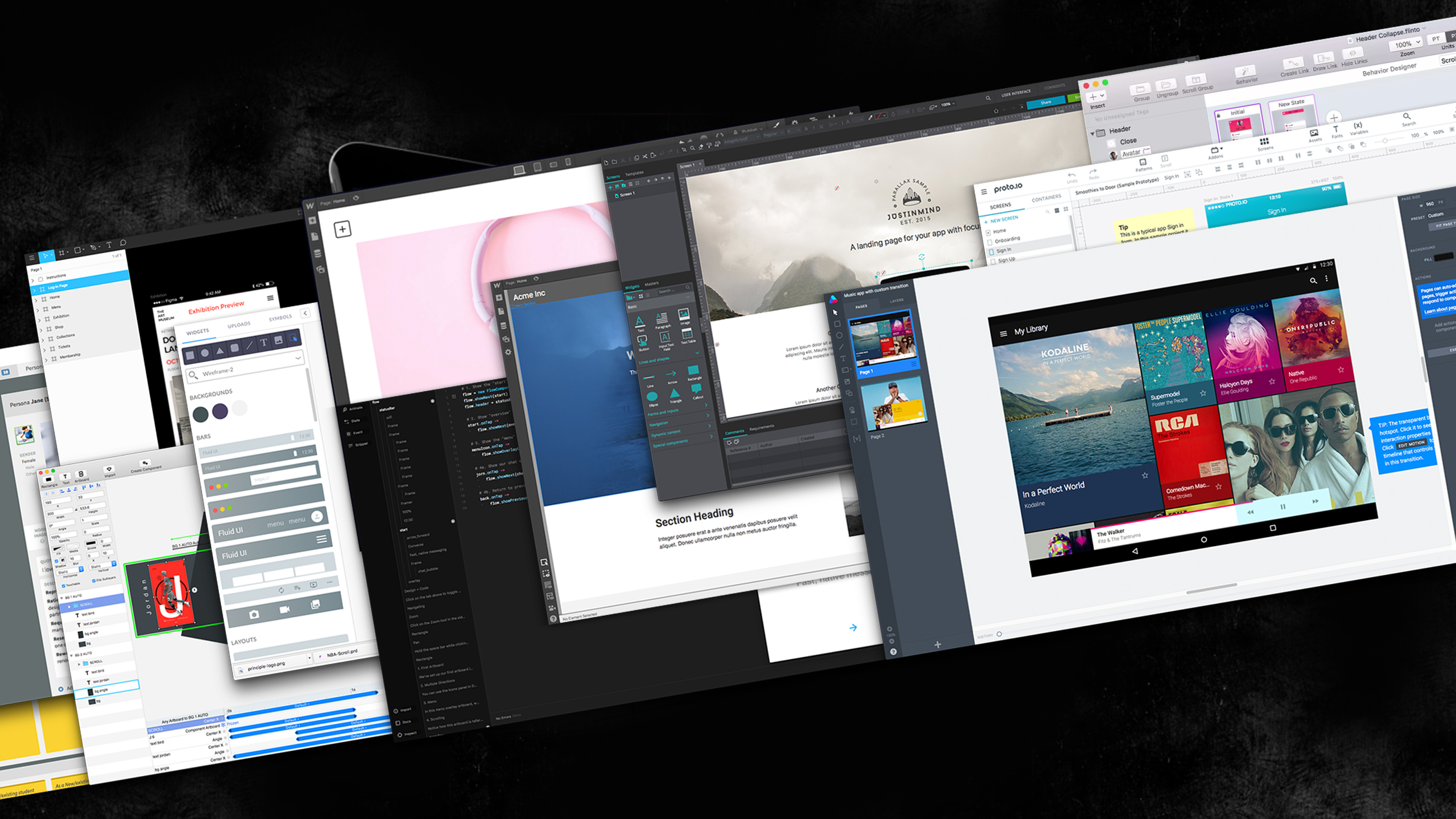
Sketch
For those that have been living under a rock. Sketch is a Mac app that’s rapidly becoming the industry standard for UI design. It is described in their own words as:
“… a design toolkit built to help you create your best work”
It has a simple, intuitive interface, a plethora of plugins and other cool features, some of which we’ll dive into below. In its early adoption by the Other Media Creative Team, it is proving itself as an indispensable tool that we are excited to push forward with in our workflow.
The transition
Our transition in adopting Sketch has been relatively slow, having put it off for some time. As noted, Illustrator did exactly what we needed it to, as we’re sure Photoshop did for the many that still clung onto that for their UI design. We felt we didn’t need to learn a new tool.
We were also huge Adobe fans, and treated other software options with a sense of distain and snobbery. We always had the preconception that Sketch was a tool for amateurs that wanted to ‘turn their hand’ to design, because the interface was simpler and, so we thought, less powerful.
Another cause for a slow adoption was that it is in part risky. There is no guarantee that the new tool will be what the team needs. There is also an overhead that the business has to swallow and justify to allow its staff to learn, research and train to get to a competent level. When this is coupled with 3-4 looming deadlines it feels safer to just open Illustrator, jam out the designs and deliver on time and budget.
In reality the learning curve, despite steep, has been smooth and the availability of online resources, tutorials and FAQs supplied via Sketch’s own website have meant we have hit the ground running at full pace.
3 kick ass things that make Sketch awesome for us
1: Nested Symbols & Overrides
These are awesome! Honestly! It makes Sketch insanely powerful; it blows us away. The magic takes a little set up and thought to reap the benefits, but when you get it right, iterating and changing elements is quick, smooth and fun.
Like in Illustrator, making changes to symbols is seen globally throughout the document, but the addition of the overrides panel on the right, means that individual instances of the same symbol can be changed simply to have different states or data. These are a powerful addition when designing quickly, because Sketch surfaces these in a way that is intuitive and accessible right out of the gates. All this is achieved by setting up a nested ‘folder’ structure and selecting the alternate state from a drop down within the interface.
This is easily our favourite feature and one we’re stoked to push further to see how we can build really good systems that can be altered swiftly.

2: Integrations with other programmes
It’s clear that Sketch is here to stay with a growing network that is building great tools that integrate seamlessly. Two of our favourites that we’re building into each project (when applicable) are Flinto & Zeplin and they are making us approach our work in a more dynamic and consistent way.
Flinto enables us to drop Sketch files into it and create low – high level prototypes from trialling small transitions to fully fledged app demos. It’s helping to build movement and stateful behaviour into our design thinking at earlier stages of the process which means more fluid, structured and dynamic interfaces. If I had to find a flaw, it’s that some of the Sketch key commands don’t do the same things in Flinto, which always catches me out as the interfaces look so similar. This aside, it’s awesome, and we’ve managed to reduce file weight and make working between the two programmes quicker.
Zeplin, on its own, doesn’t do a huge amount. However, when you use the Sketch plugin to send your file to it, it comes alive and gives our developers an accurate breakdown of each element on the screen simply by clicking on it. From these elements they can view a brief snippet of code for them to use as the basis of their build, which cuts time and saves money and when I update a design, with the click of a button, the developer always has the most recent version at their fingertips.
By using Zeplin we are able to design accurate, live interfaces quicker with less ambiguity that results in fewer QA issues being raised. As a designer it means I get more beautiful products realised sooner and our developers are excited too because they have an explicit set of values and designs to build against without the need for interpretation.

3: Layouts & Grids
Again, nothing that you can’t already do in Illustrator, but Sketch seems to handle grids just a little better in our opinion.
Assigning specific grids to different art boards of differing sizes, including variable row heights and turning specific grids on/off via keyboard shortcuts just makes using them a damn sight easier than in Illustrator. We’re finding that by defining this grid structure early on we can create a more consistent vertical rhythm that can be adapted as the project evolves. We are also using this approach to help us make more adaptive components within templates breaking the grid down further to offer more fluid and adaptive views.

Why we won’t kill off Illustrator fully.
Illustrator, like any of the Adobe software, has its place in many designers’ workflow. I have read many articles where digital designers have been unable to drop their monthly subscriptions due to the benefits that Adobe offer and in many cases there isn’t a comparable product set. For example, InDesign is still the king of layout for print applications and Photoshop, despite our strong feelings for it not being a ‘design tool’ is our favoured photo-editor of choice. The Adobe Creative Suite is powerful and in the most part works well.
You can create icons and design almost anything in Sketch, but nothing is going to, for now at least, come close to the shape manipulation or bezier control you get in Illustrator. I’ve also found that the Sketch pathfinder functions can become confusing with complex shapes and the manipulation of layers to deliver the desired results. Instead I’ve opted to import many of my UI design components into Sketch from Illustrator as SVGs giving me the flexibility to edit and colour them with masked layers, but without losing the detail I often find I need.
In summary
Sketch is an exciting chapter in the evolution of our design workflow here at Other Media. More and more as our process changes, we are moving away from creating rigid, structured page templates, and focusing on the modular and component level of an interface. Due to the nature of the programme it is helping to lead us in this direction of crafting full design systems that align themselves as complete digital branding solutions.
The building blocks that Sketch allows us to easily define, such as detailed style tiles, and smaller, reusable branded and functional elements, means we can create more consistency and brand adhesion.
When you become accustomed to a particular tool or way of doing things, introducing something new can be hard, scary and challenging. Sometimes it doesn’t work, but sometimes it shakes things up and makes you approach things in a new way. It’s safe to say Sketch has done that here, and it’s allowed us to continue making, designing and building award winning work in a more economical and creative way. We’re excited to see how we can further optimise our process as more complementary tools and integrations become available.
For further reading check out the article we wrote about the tools and programmes we will be exploring this coming year to help us work better.