Developing for Apple watch
When Apple announces a new class of product to the world, two thoughts invariably come to my mind and I am sure the minds of most of the Apple developer community. First, when can I get one? Second, when can I start making apps for it? This was certainly the case with iPhone and iPad and is also true of Apple’s latest creation, Apple Watch.
We have already previously discussed at length the questions of what exactly Apple Watch can do and how we design for those nifty new experiences tailored for the wrist. What I would like to talk about are some of the observations the development team here at Other Media have made about developing for Apple’s new baby.
First things first; any iPhone app which delivers notifications – a breaking news article, say, or a cooking timer finishing – can now display those notifications on Apple Watch without writing a single additional line of code.Very cool. Apple Watch and iPhone use heuristics to determine which device is more appropriate to send the notification. Best of all, no work from the developer is needed. It’s all automatic. However, if developers put the work in, they can also enhance the user’s experience by allowing them to interact with apps straight from the wrist.
In November 2014, hot on the heels of the September Apple Watch reveal, Apple released WatchKit to the world. WatchKit is a set of tools that allow developers to create Watch Apps, Glances, and Actionable Notifications. Watch Apps contain a full user interface that users can control and interact with. Glances provide the user with timely, read-only information that – as the name suggests – can be seen at a glance. Actionable Notifications are ‘high fidelity’ alerts that can display more than just text and allow users to take actions right from the wrist.
What struck me most about the WatchKit documentation was the emphasis throughout on quick interactions, measured in seconds not minutes. The WatchKit reflected this. The array of user interface elements was small; offering only switches, buttons, image views, text labels, maps (only static maps, no scrolling around), and progress bars.
The laying out of these elements into a user interface, or view, is simplified too. Elements can be laid out horizontally or vertically into ‘groups’. It is possible to have as many groups as you like, but if the view is taller than the screen then users can scroll with their finger – or the Digital Crown. More complex layouts may be achieved by nesting groups inside other groups, making this far more powerful than one might initially think.
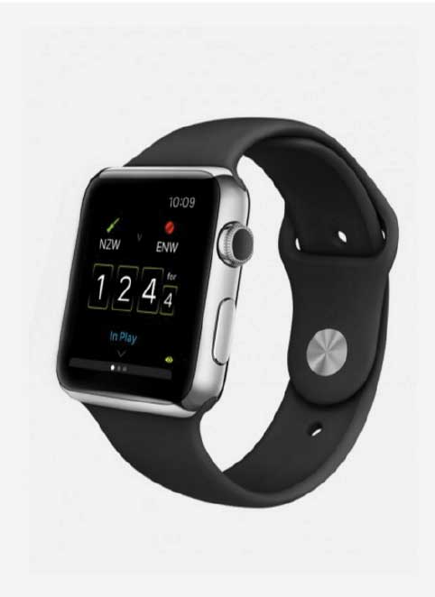
Apple emphasises that WatchKit apps, as well as Glances and Notifications, are run from the host iPhone. Apple Watch is only informed of user interface changes; essentially Apple Watch is a second display – an extension – for iPhone. This limits what a developer can reasonably do without either hitting a road-block, or adversely affecting the user’s battery life. A concrete example of this would be animated images. We really wanted our Apple Watch app to have animated images. Indeed, our first instinct was to generate the graphics in code. However we soon discovered this would not be reasonable for an Apple Watch app. Instead we decided to create a sequence of images and replay them on the watch as an animation. Furthermore we optimised the images and in doing so, used 98% less space. All of which will keep users happy. It’s the small things like this that make all the difference.
Apple Watch apps can also communicate with their iPhone counterparts and vice-versa. To that end, Apple strongly recommends that any ‘heavy lifting’ that may be required, such as accessing the internet for data, should be done by the main iPhone app instead of the Apple Watch app. With this in mind we thought very carefully about how created architecture for our app to ensure maximum performance and energy efficiency. This can only be a good thing.
I could go on and on, talking about the many other interesting discoveries we have made and lessons learned in the past few months, but to summarise: Apple have done an excellent job with WatchKit 1.0. It gives developers just the right blend of flexibility and power, whilst ensuring the apps conform to the new user interface paradigms and does so in a power efficient manner. It’s a brilliant start and I for one cannot wait to see what Apple has in store for Apple Watch at the World Wide Developers Conference in June.
Jonathan Downing
iOS Developer


