Designing for Apple watch
As with all new or emerging technologies, there are bound to be those with opposing views and opinions on how beneficial, superficial, useful or even gimmicky a product will be. The Apple Watch is by no means an exception to this rule.
When the watch was first unveiled back in September 2014’s Apple keynote, it divided the Studio here at Other Media. Obviously, on one side, the diehard Apple fans (boys and girls) jumped straight on-board with renewed vigour and excitement as their beloved Apple proclaimed that they were to release their first new product since the iPad back in 2010. Others, myself included, were more sceptical and dismissed the concept of another, potentially over-the-top digital watch interface. The purist in me would never consider giving up the mechanised beauty of an analogue timepiece.
However, as with all things ‘new’*, the creative, brand and business opportunities that come along with these types of products can be huge. Here at Other Media we are lucky enough to have some clients who are as innovative and forward-thinking as we aim to be. So, when we approached them regarding the watch they were just as excited and challenged us to see what we could do with their brands to bring them into this untapped market.
When we first started batting ideas around for these clients the limitations of space became immediately apparent.
Initially this lack of space caused unwanted tension and frustration within the design of our interfaces. Elements were cramped. Icons and logos were pixel-crushed** due to the limited space and hierarchy was not achieved. We were trying too hard to replicate the complexity of an entire iPhone application into something a fraction of the size with half the level of functionality to hand. Wrong approach.
We began thinking about the watch in a very different light. It isn’t ever going to be a version of the app on your wrist, but an extension to the app in your pocket. Once we embraced this new rationale things began to fall into place very quickly and we were soon able to craft some beautiful experiences for Apple watch users.
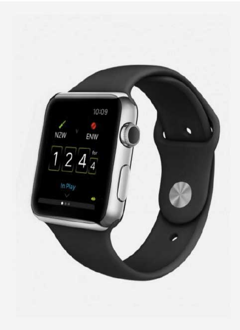
We elevated the content users viewed most frequently and designed it into a simple, stylish, minimal, yet clear and direct tool to access this content.
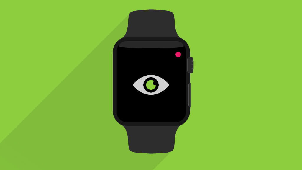
The use of strong iconography and bold colours has played a huge part in our Apple Watch rationale where we look to create strong contrast and simple imagery to support the typography on the screen.
Embracing San Francisco (the font Apple have had developed to work on the watch) as our core typeface helps keep the experience feeling native yet unique to brands we are working with.
The overarching principle we began to adopt was that if it isn’t necessary and it doesn’t look beautiful, it shouldn’t be there. The essence of stripping things right back to the core elements of fundamental design was, ultimately, extremely liberating.
As I sit here now on the busy commuter cattle train out of London, I now long for the benefits the Apple Watch will deliver. My phone has just started ringing in my pocket and it’s time to elbow the young lady next to me in the ribs as I attempt to retrieve it to check the message. Case in point.
And with that I’ll leave the discussion open. Please feel free to share or feedback, I’d love to learn of your experience working with the watch.
Matt Emmins
Graphic Designer
* I use ‘new’ with a subtle tone of snide sarcasm as watches have been around since the 15th Century.
** You know when a logo is super detailed and then you make it smaller and it just looks like a dead fly on your monitor!