Cambridge United's Brand Evolution: Kicking Off a New Chapter
Over the past 18 months Cambridge United have been on a journey to evolve their identity, seeking to ensure they protect their history and heritage, whilst developing an identity fit for today’s modern world and representative of their aspirations.
Driving engagement
The goal of the project is to help drive engagement and income and is an important part of the Club’s modernisation project – looking to the future whilst respecting the past.
After extensive consultation, to ensure fan and other stakeholder engagement, the Club have now revealed their new identity and we’re delighted to roll out the new brand across the Club’s website and apps.
“We are delighted with our new-look website and app. The team at Other Media have done a great job of bringing our new identity to life."
Head of Communications, Cambridge United FC
Digital-ready crest
At the heart of the new identity is the redesigned Club crest. Recognising the paramount importance of the digital experience in modern football, the new crest has been designed with digital reproduction a key consideration.
The crest’s less complex design guarantees legibility and impact regardless of scale.
The versatility of the new crest allows for its application across various Club entities. Its design allows for pairing with varying wordmarks, making it perfect for the Men’s team, the Women’s team, the Academy, and Foundation.

A holistic brand identity
This redesign transcends a mere aesthetic refresh, introducing a holistic brand direction that encompasses new fonts, a subtly altered color palette, and distinct iconography.
These elements are designed to inform the entire visual experience, from digital platforms like the website and app, to merchandise and stadium branding.
The new color palette is characterised by its warmer, richer tones that evoke a sense of tradition and passion. Beyond visual appeal, the palette has been developed with enhanced accessibility in mind, ensuring a more inclusive experience for all fans.
This strategic approach delivers a cohesive and unified brand system, demonstrating a singular vision and sense of identity across the entire Cambridge United family.
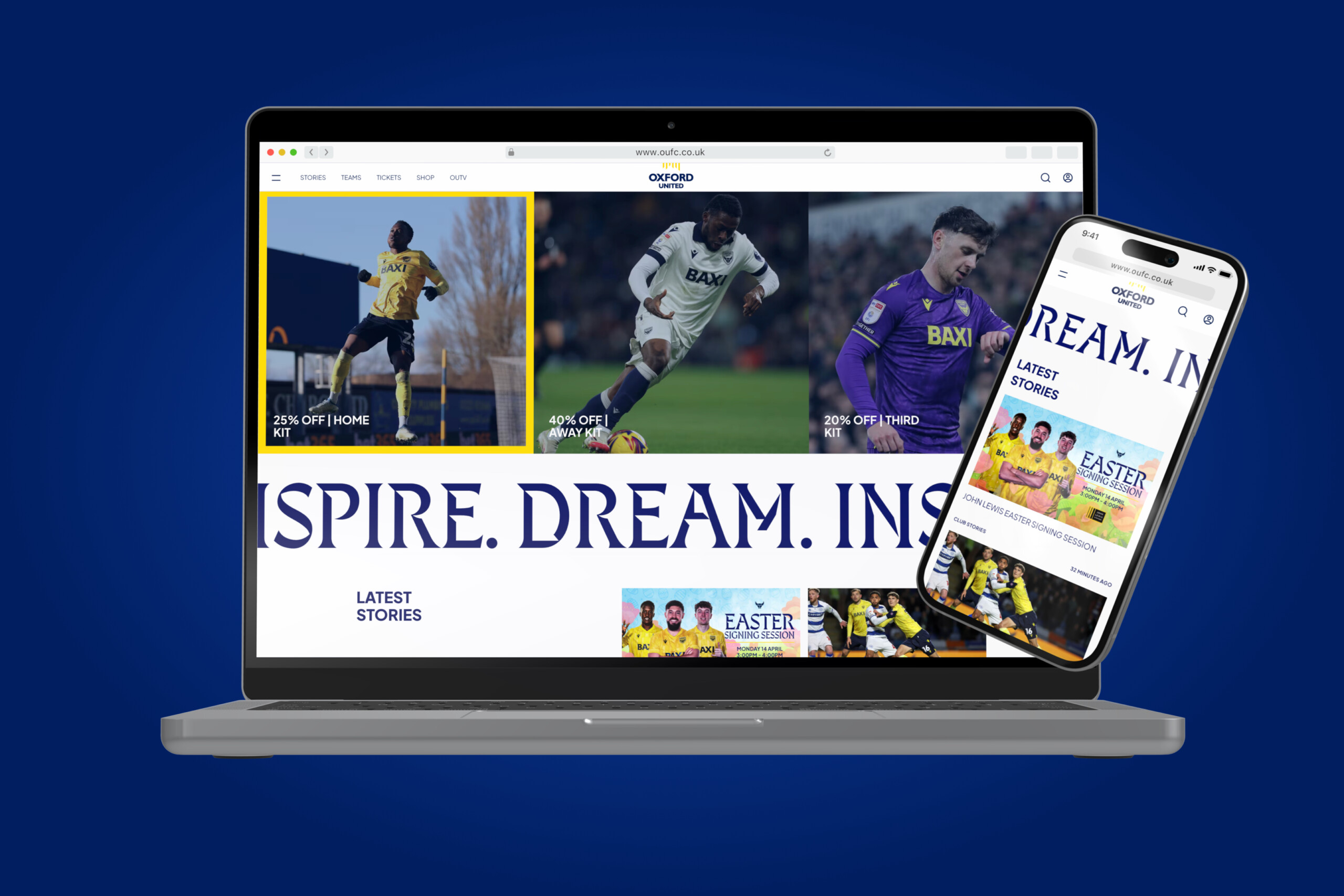
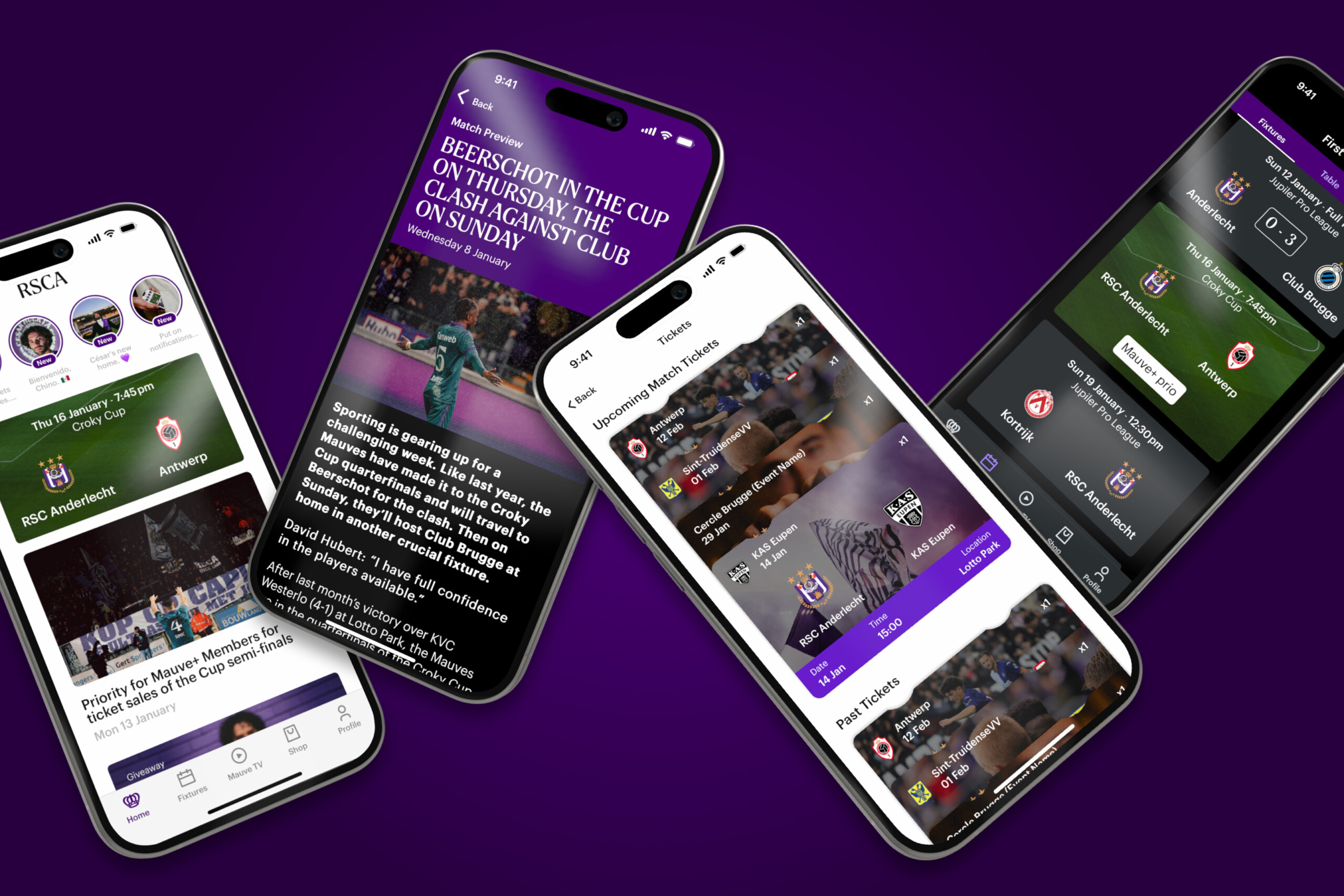
Web & App Refresh
The Club website and apps have been treated to an upgrade as part of this brand evolution. The entire digital estate has been revitalised with the new colors, fonts, and iconography.
This digital transformation creates a more visually aligned and “cinematic” feel, directly reflecting the sophistication and dynamism of the new crest and colours.

Matt Emmins, Creative Director at Other Media, said: “It’s been great to build on the existing site and apps that fans have become familiar with this past season, enhancing them further to solidify the exciting work that the Club is doing to bring a renewed visual and brand experience to the fans.
“We’ve worked closely with the club and their branding design lead to embody the spirit of the Club through the use of their bold new identity and the supporting elements such as their scarf motif that adorns the footer and the cathedral windows found in the background of various cells to bring texture and cohesion.
“Its been great to iterate and see the digital spaces evolve.”
Dan Branowsky, Head of Communications at Cambridge United FC, added: “We are delighted with our new-look website and app. The team at Other Media have done a great job of bringing our new identity to life.
“When we began working with Other Media just over a year ago, we were all acutely aware that this rebrand was on the horizon, and I couldn’t be happier with how they have helped us through this process.”

Take a look at the new-look cambridgeunited.com and see how the new brand identity has been brought to life.
If you'd like to deliver more for your audience, get in touch now
Let's talk